Location: Site Configuration > {Module} > Field Definition
Encodify uses fields to store all information uploaded to the system. This is basically information relating to companies, their products, services or activities, such as the name of a company, its address and telephone number, a type of product, a picture of a product, a date of a planned activity, etc.
Data relating to one particular project, company, product, etc is kept in a module as a separate entity referred to as an item. An item is essentially a set of fields in a module. A module may contain any number of items, but only one type of item. That type of item is defined within the module in the Field Definition configurations section.
The administrator must determine the types and number of fields that will serve to contain information relevant to the purpose of the module. Correct determination of pertinent information is crucial since it prevents having to add information to each item or superfluous information from being entered initially.
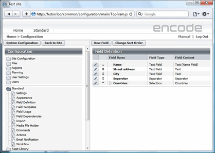
Fig.1.: Field Definition configuration page
Information in the system need not be undifferentiated. Though information about, say, a product, such as Name, Description and Price could all be classified as text, it might be worth classifying the price as a Decimal. This is useful for two reasons:
This ensures that the entry made by the user is of the right type;
More importantly, however, it allows the system to treat the data differently. Unlike text, a number (integer) or decimal can be used in calculations that the system can carry out.
There is also certain data that cannot be represented as text, such as files. Different types of content that fields can contain are referred to as Field Content.
There are the following types of Field Content:
Name | Field Content |
|---|---|
Text | All forms of text. |
Fixed text | Same as above except that the text you enter is unalterable. |
Requires the text entered to conform with a standard email address (name@domain.area). | |
URL | Requires the text entered to conform with a standard URL (protocol://domain.area; if no protocol is specified, http:// is inserted). |
Integer | Will only take an integer. |
Decimal numeral | This can include a fraction. Only the two most significant figures in the fraction are shown. Please note! Starting from version 9.101.0 Number format can no longer be specified on a field definition level. Number format will follow locale settings only. |
Percent | This can include a fraction. Only the two most significant figures in the fraction are shown. The value displayed is in percentage. |
Calculation | A field that can carry out rudimentary calculations with numerical fields in the module. |
Automatic numbering | Used to assign fixed unique integer numbers to entries in the module by way of identification. |
Text Concatenation | Text concatenation is a field of the type Fixed text that can combine the content of several fields into a text string. Text concatenation fields can consist of any number of fields and of any field types. Text Concatenation fields have a formula that represents the fields-constituents of the text concatenation field. This field has a special setting “Make this field searchable” which can be set only when creating the field and cannot be changed for an already existing one. The enabled setting allows searching by a concatenation field. The differences are:
|
Field Reference (v16) | A field that can carry out data from the parent module and store it as read-only |
Date fields before version 9.101.0
| |
Date | A number of different formats are available to pinpoint a specific day. |
Date-time | Provides two boxes for specifying a date and time respectively. Supports the same formats as Date. |
Week/Year | Shows date as week and year like ww-yyyy |
Month/Year | Shows date as month and year like mm-yyyy or MMM. yyyy (month is displayed by their names respecting the site language) |
Date fields version 9.101 and later | |
Date | Skeleton value selected in Field definition configuration will define the type(format) of the date field. For example: Date: dd.MM.yyyy > 15.05.2021 Date time: dd.MM.yyyy HH.mm > 15.05.2021 21.30 Week year: ww-YYYY > 02-2021 Month year: MMMM yyyyy > October 2021
List of formats listed in the skeleton field will follow user's locale settings. This defines month value localized value and date/time separators |
XMP/IPTC | Allows to retrieve the metadata from uploaded image files. Field definition of this type provides two configuration selectboxes:
For some tags (e.g. Document Title, Description, Author etc.) you also can make the field editable by ticking the Editable checkbox, so it will be possible to write the metadata into the uploaded file by editing and saving the corresponding field. |
The concept of fields implies not only content but also a form that determines how the content is presented or entered in the system by the user. In the system this is referred to as Field Type. One can distinguish between the following categories of ways to enter information:
Field content | Description |
|---|---|
Simple entry | This type of entry is used for information that can be expected to be widely different or even unique to each item. These could be product names, product numbers, or product prices. |
Simple select | The system can be made to present a number of options from which the user must select a single option. A product may, for example, belong to certain categories. When the product is registered in the system, it is assigned a category from the list of categories that the administrator has made available. When subsequent searches are done to locate the item, the category can be found on a similar list (this list will only display the categories which have been assigned to the items in the system at the time). This has the advantage of controlling categories used, so that users do not create more categories than necessary (spelling errors would also generate separate categories). Examples of single select methods include radio buttons and select boxes. |
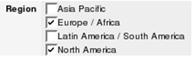
Multi select | This category of Field Type allows the user to select more than one option. Sometimes a product may belong to more than one category. Soap, for example, might be categorised both as a bathroom product and a kitchen product. Examples of multiple-choice selections include checkboxes and multiple-select boxes. |
The Field Type has a visible effect on the user interface, being the means by which the user interacts with the information in the system.
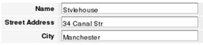
Text Field | This field allows the user to enter a single line of text.
|
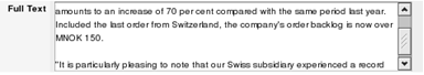
Text box | This field allows the user to enter multiple-line text. Once the text starts exceeding the box dimensions, the box becomes scrollable to accommodate the additional lines.
|
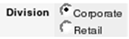
Radio buttons | Radio Buttons provide a presentation of options, of which only one can be selected. This type is to be preferred over the other single select type, the Select box, when the options are few (2 or 3), particularly if there are many other fields to be filled out.
|
Check boxes | Checkboxes are multiple-select types. Like with Radio Buttons, all options are immediately visible to the user. Sometimes a single checkbox can be used to provide a simple boolean answer (e.g. yes/no, true/false, on/off, enabled/disabled).
|
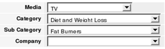
Selectbox | The Selectbox is a single-select type. Initially only the selected option is visible to the user. When the user clicks the box, it expands to display the other options. A selectbox always has an empty option that corresponds to a non-selection.
|
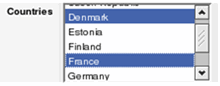
Multiselect field | Multi-select fields are multiple-select types. This field shows as many as five options in it and becomes scrollable when the number of options exceeds 5. Clicking on an option will highlight it but undo other highlighting in the box. Clicking on other options while holding down the CTRL key will keep other fields already highlighted. Clicking on one option and then another while holding down the SHIFT key will highlight all options between the two, both inclusive.
|
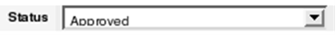
Status field | The Status Field looks like a select box and is used in workflows. Options defined for a status field represent workflow stages which refer to different states of module items.
For more information on workflows, see Workflow in the chapter Planning Tools. |
There are many possible combinations of Field Content and Field Type, all of which provide a number of options. Below, we will look at the different types of Field Content and Field Type and explain their effect on the system.
When defining a field in a module, after you have chosen Field Content and Field Type, there are some standard options that can be configured. Not all of these standard options are available to all combinations. In the right frame (Field Values) there are some less standard configurations. These configurations vary greatly.
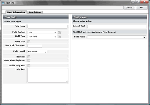
Fig.2.: Creating a new field: the field is defined, and options are set in the left part of the dialogue box, and the field values are specified in its right part
Different combinations of Field Content and Field Type will yield further options to configure. Many of these options are available for most combinations, but a few are available only for very specific combinations. In the table below, all the options that may become available are described:
Field Definition options
Name field (Disabled. Enabled automatically for the first date field) | With this option enabled, the field becomes the item identifier and the user will be able to access the rest of the information in the item by clicking this field. |
Max # of Characters (Unlimited) | This limits the number of characters the user can enter in the field. |
Field Length (Full Width) | This limits the length of the field into which text is entered. The length is represented in pixels. |
Rich Text Editor (Disabled) | Only applicable to Text Box fields. Enables the Rich Text Editor functionality for the field in Add/Edit item window. This allows to use HTML markup, styling, media resources. See more details in the Rich Text Editor chapter. |
Required (Disabled) | This makes filling out the field mandatory when entering information for an item. If the user fails to fill out this field, the system will alert the user about the omission. |
Don’t allow duplicates (Disabled) | Validation for value uniqueness. This prevents the same value from being entered in the field for different items. Uniqueness check is only done for the active items, inactive items are ignored. |
Link to “Create New” (Disabled) | Triggered by the Module Field Content, this option enables users to create new entries in the linked module by clicking an icon next to the Module field. |
Enable Help Text (Disabled) | This enables the customizable Help feature for the field. It will create a small Info icon in the field in the system so that the user can open a Help window to find out how the field should be filled out. |
Help Text (None) | Write the help text in the box to make it available. |
Link | This configuration select box is available for Module Link fields and has two options: “Don’t Link” and “Open Link in Pop-up window”. The latter option makes a hyperlink out of the module link value, which allows for opening the linked item in a separate window Note on User Fields: The User field does not have this explicit setting, yet it defaults to pop-up behaviour in Module Views and Spreadsheet widgets. However, this functionality is not supported in the Pivot Table widget. |
Show Preview | This configuration select box is available for Module Link fields and has options : ( mapped module link media holder configuration) |
Field Template for search | This option is related to the Module Links fields. The select box lists field templates in the linked module. The selected template will add the fields from the linked module to the search result of the target module. |
Hide Module Field in Search | The option is triggered by the Module link field content and hides the Module link field in the search result of the module. |
Index | This checkbox is available only for optioned fields. When enabled, the special indexes will be created for the field options, making searching by this field faster. On the other side, it causes a slowdown in saving the values in this field, especially when importing a huge number of records. |
Specific combinations of Field Content and Field Type determine the types of values and options to specify in the right part of the Field Definition window, conventionally known as Value Window. These dependencies are stated in the table that follows. Note also that selecting a specific Field Content reduces the number of available Field Types.
There are 7 possible types of value windows, all shown in figures below the table, along with the necessary explanations.
Field Definition — Value windows
Field Content | Field Type |
|---|---|
Text | Text Field, Text box, Radio buttons, Check boxes, Select box, Multi-select field, Status field |
Fixed Text | Fixed text |
Text field | |
URL | Text field |
Integer | Text field, Text box, Fixed text, Radio buttons, Check boxes, Select box, Multi select, Status field |
Decimal numeral | Text field, Text box, Fixed text, Radio buttons, Check Boxes, Select box, Multi select, Status field |
Percent | Select box, Multi-select field, Radio buttons |
Calculation | Fixed text |
Automatic numbering | Fixed text |
Text Concatenation | Fixed text |
Field Reference | Fixed text |
Fig.3.: Field definition: Default text
This value window provides a field for entering a default text that will always appear when an item containing the field in question is created. The other field is a selectbox that enables you to set this field to be filled out automatically from another module, with a field selected from the list box below it, with all viable fields.
The fields, both of the supply module and the recipient module, must be text fields. A module field linking to the supply module must be created prior to the creation of this field. When the user selects an item from the supply module (identified by the Name Field), the text field is filled.
Instead of filling the text field with values from the supply module, you can use the User field as a trigger and fill the text field with user details information (name, email, address, etc.).
If the User field is selected in the “Field that activates Automatic Field Content” selectbox, the list of user details is available in the “Field with content for Automatic Field Content”.
When the configuration is done, changing the user in the User field in the Add/Edit Item window will correspondingly fill the related fields with the corresponding user details.The fixed text option provides a means of entering fixed text that will appear among the other fields when the item is created.
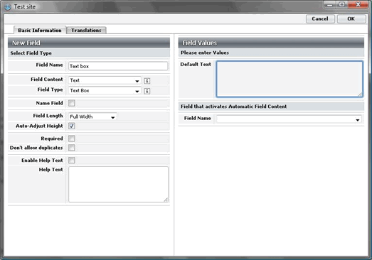
Fig.4.: Default text for text box
This value window prompts you to enter values for selectable fields. Use the Sort Order box to determine the order of the menu items. By default, the order will be alphabetical for fields with textual content and numeric for fields with numerical content. Optionally, items may be ordered as listed. If this option is selected, small arrows will appear next to the menu items on the list so you can shift them up or down.
The menu items themselves are entered below in the text field labeled Create. Once you’ve entered the text and clicked OK, the new menu item appears below the text field. To delete an option, click the Delete icon next to it. You may also choose to make one (or more, if the type allows it) of the menu items preselected. To pre-select a menu item, select the radio button (or checkbox, if it is a multi-select field) opposite it.
A field template can be assigned to the particular options of selectbox fields. When the user selects a value in the option field, fields corresponding to the template assigned to this option value will be displayed in addition to those displayed by the base template of the module.
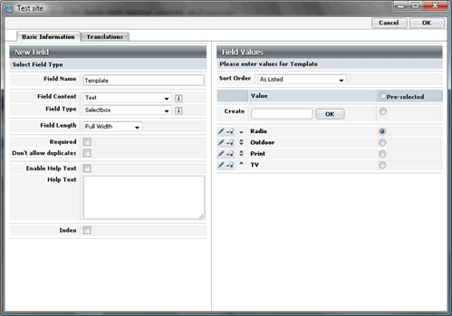
Fig.5.: Field definition: Selectbox
Automatic numbering only requires that you designate the initial value. The default initial value is 0
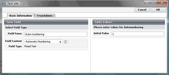
Fig.6.: Field Definition: Automatic numbering field
Selecting the type Module for a field prompts you to select the module that the field must link to. By default, the field made available through the module field is the Name Field of the supply module.
Setting “Delete referencing items on parent removal” allows for tightly connecting the items in the current module to the linked parent module. If the option is enabled, the child-linked items will be removed on parent item removal. The removal method in the referencing module is respected (delete or inactivate). E.g. If “Make inactive” is set as a deletion method for the referencing child module, all the referencing items will be correspondingly made inactive.
Note that referencing items are not deleted even if the option is enabled, in case the user does not have “Delete” access to the referencing module or particular item.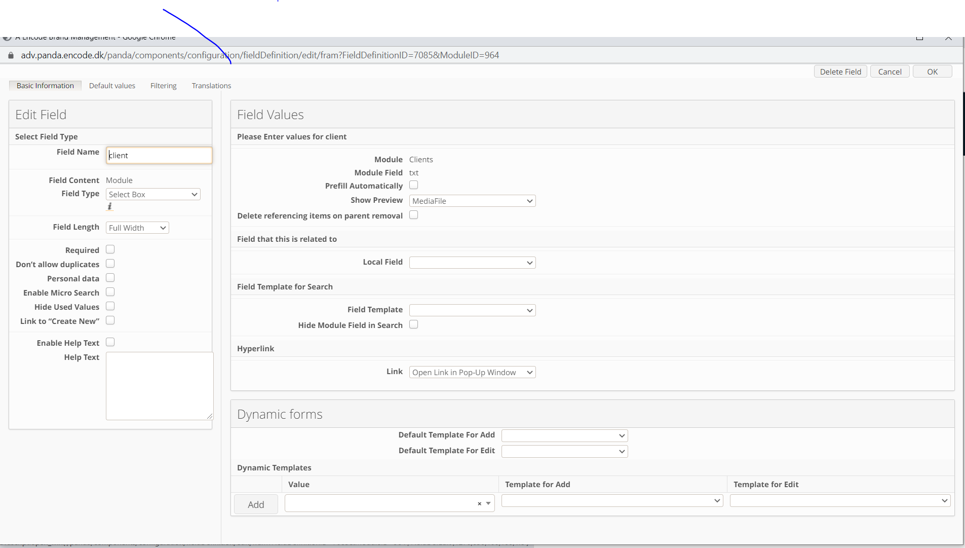
Fig.7.: Field definition: Module field
This window configures the filtering of the User field. A filter limits the number of users shown in the user field. Only users with the values selected in “Define Filter” will be displayed. If “No Filter” is selected, all active users will be shown.
It is possible to filter by Title or User Groups. If filtering by Title is enabled, a list of the titles defined at Site Configuration > User Settings > Titles will appear in a multi select box. Selecting titles in the box includes users with those titles in the user field. Users who have a title not highlighted in the multi select box will not be displayed in the user field.
When filtering by User Groups is enabled, only users who are in the same group with the current user will be available for selection in User field.
Note! Filtering by User Groups is ignored for Site/System administrators.
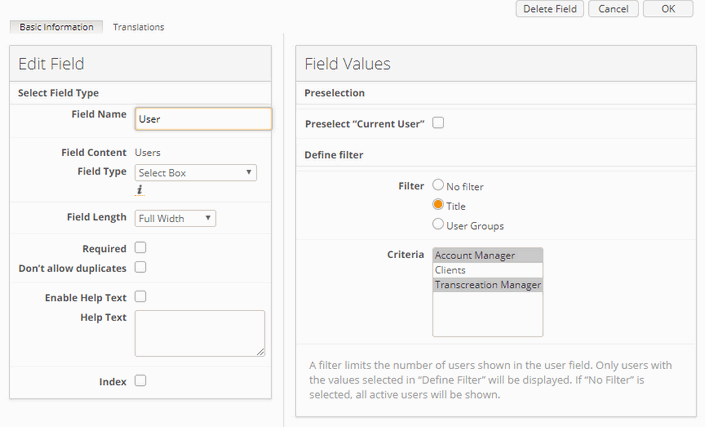
Fig.8.: Field definition: Users field
Selecting the type 'Field Reference' for a field prompts you to select the module that the field must link to and the field with content from that module:
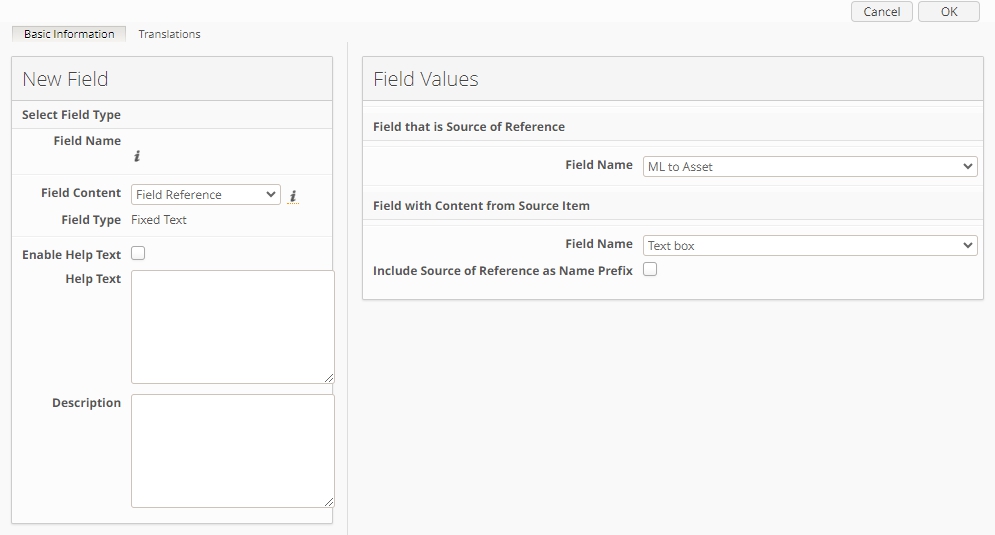
Fig.9.: Field definition: Field Reference field
The name of this field type is generated automatically and updates on save. By default, name duplicates the Field Name selected as 'Field with Content from Source Item' (on example above, Field Name will be "Text box"). There is an option to 'Include Source of Reference as Name of Prefix', when enabled, Field Name will be composed from both field names selected in the right-hand side of the Field Configuration modal (for example, above, Field Name will be "ML to Asset Text box").
Known Limitations (related to Field Reference fields):
Only single select fields (selectbox, status, radiobutton) are available in ‘Field that is Source of Reference’;
Reference fields are not shown in Fields Log (like all other Fixed Text fields);
It is impossible to retrieve changes from Reference fields via Notification Rules;
Value from the Duration field will be copied in milliseconds to the reference field (as it is for fields with auto content);
Classic UI: Field Reference fields are not shown in the Filter;
After module import, some reference fields can be imported with an empty Field with Content from Source Item: added warnings in Fields Overview for references with errors after import.
To create a new field in the module, follow these steps:
On the toolbar, click Create Field.
In the dialogue box that opens, type a name for the field in the Field Name box.
Specify the Field Content and the Field Type.
Configure the options for the field.
Enter the required values in the value window.
To edit an existing field, follow these steps:
Click the Edit icon next to the field that you want to reconfigure.
In the dialogue box that opens, change the field name if desirable.
The Field Content is unalterable, but fields of a simple type can be altered to another simple type and selectable fields can be changed to other selectable types. The only exception isthe Status Field, which is unalterable.
Configure the options for the field.
Change the values in the value window as necessary.
To delete a field, follow these steps:
Click the Edit icon next to the field that you want to delete.
In the Edit Field dialogue box that opens, click Delete on the toolbar.
Do not delete a field once the system has been brought into use unless entirely certain that the field will not be used in the future! Once a field is removed from the system, all data entered in that field becomes unrecoverable. Altering the content of a field yields the same effect.]
Note: It is not possible to edit values for the field content Titles, Countries, Regions, Sub Regions, and Divisions. Those fields are not sortable in the module search result.