Overview
Header Widgets are interactive elements designed to enhance the user experience by streamlining workflows and improving workspace organisation. They allow you to create visually distinctive section headers, helping to structure content clearly and effectively. In addition to labelling sections, you can add shortcut links to enable quick navigation between key areas, such as creating a new item, navigating to a module, opening a URL, or linking to another workspace—making your workspace more intuitive and efficient.
Understanding Header Widgets
Once a Header Widget has been configured, it will appear on the Workspace. Users with Creator, Co-owner, or Editor permissions can drag and drop the widget to reposition and resize it as needed.
Clicking the card will trigger the configured action.
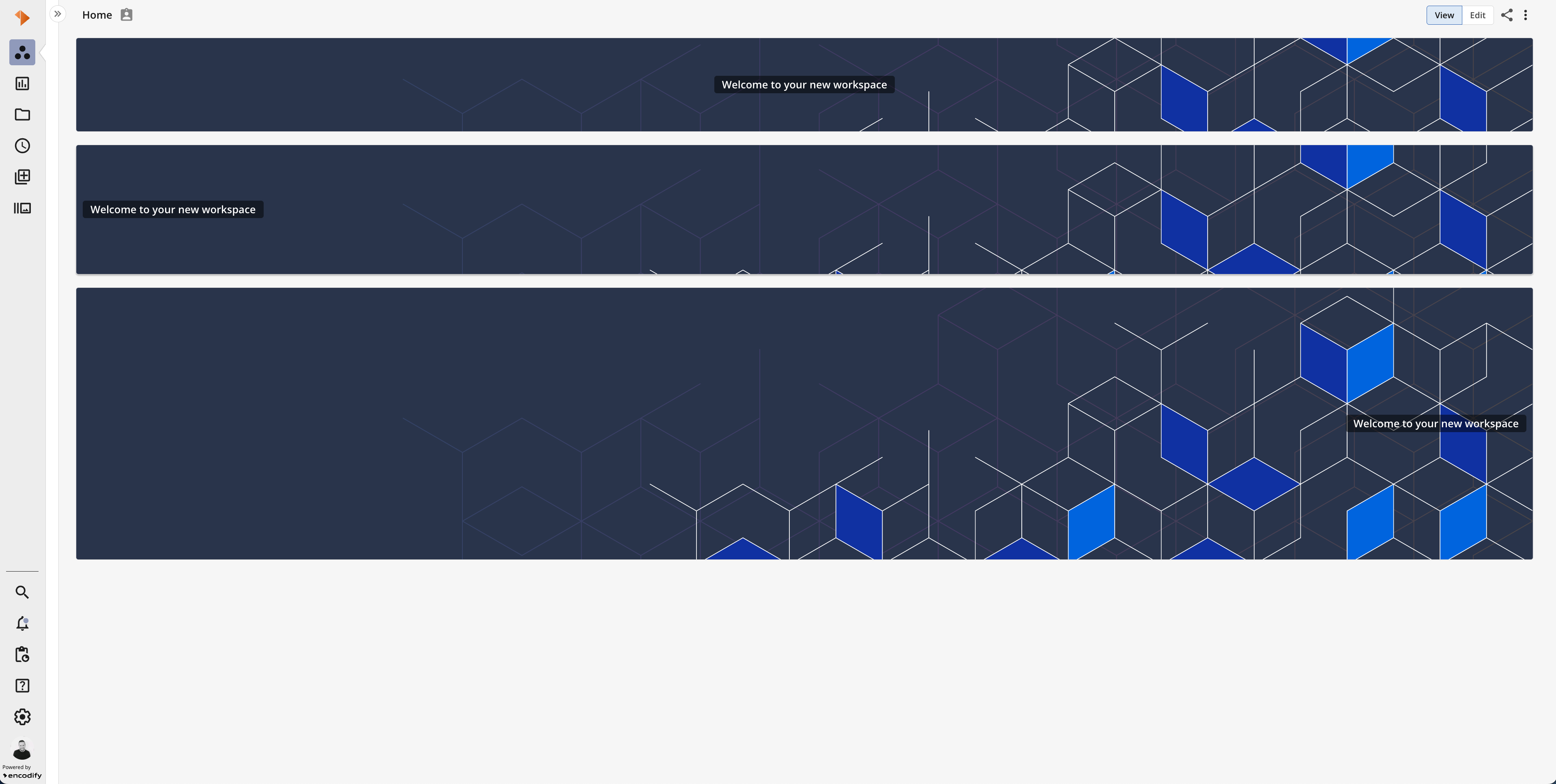
An image showcasing Header Widgets of various sizes displayed on a workspace in view mode.