Overview
Card Widgets are similar to Button Widgets but present the action within a visual card that includes an uploaded image or icon, providing a more engaging and branded experience. Using Card Widgets can improve efficiency and organisation within the workspace. These interactive widgets enable a range of actions, such as creating a new item, navigating to a module, opening a URL, or linking to another workspace—all from a visually intuitive interface.
Understanding Card Widgets
Once a Card Widget has been configured, it will appear on the Workspace. Users with Creator, Co-owner, or Editor permissions can drag and drop the widget to reposition and resize it as needed.
Clicking the card will trigger the configured action.
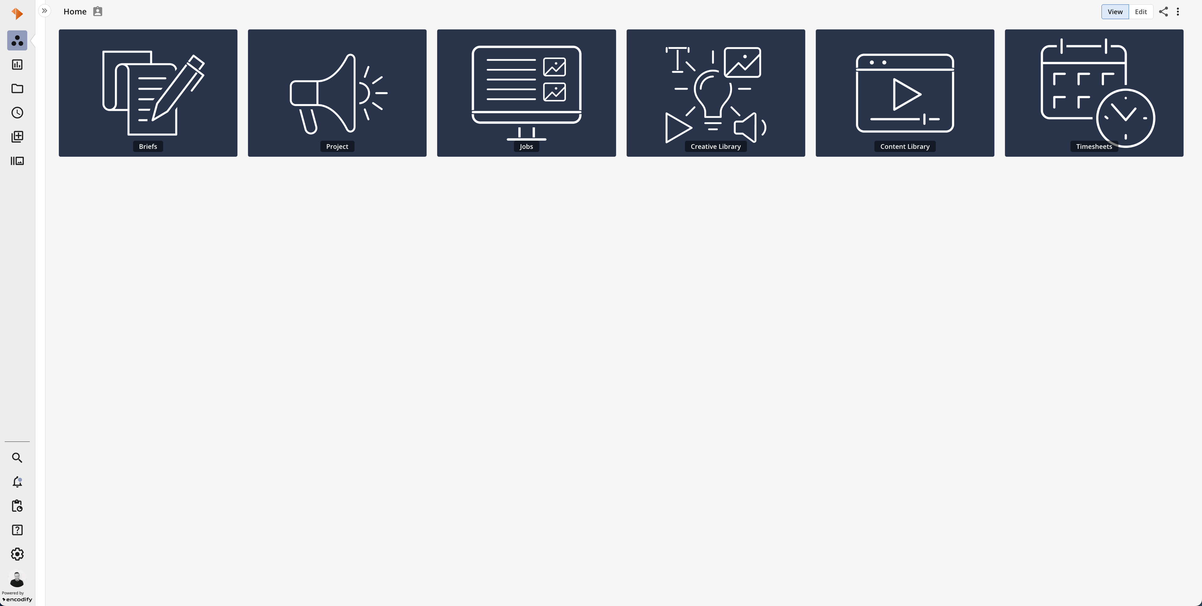
An image showcasing several Card Widgets on a workspace in View Mode