The Text Element, or Text field, is a placeholder for the text that users can include in their Ads. Adding a Text Element to an XML template involves specifying such parameters as the size of the element, its position on the page, parameters of the font applied to the text within the element, alignment of the text inside the element etc. The following table looks at all the settings of a Text Element on both Text Field Settings and Font Settings tabs.
Main settings
Text Field Settings Tab
Option | Default | Meaning |
|---|---|---|
Name of the Element | None | Name of the element as it will appear in the Edit Ad window. |
Show as Text Area | No | Selecting this option displays the element as a multi-line text area. To set a number of lines available to the user, type the number in the Rows box (the default number is 4). |
Prefilled Text | None | This is where you can specify default text that the user will see in the resulting text field and will be able to edit. |
Text Case | As typed | When any of non-default option is selected (“ALL UPPER CASE”, “all lower case”, “Capitalize Words”), the text will be transformed accordingly and rendered in result PDF |
Get Text from | None | Use this option if you want the user to select content for the element from a predefined list of values instead of typing in their own text. The option specifies the module that the values will be taken from. The list of available modules includes all active modules found on the site. |
Field | n/a | Field in the selected module that the text should be retrieved from. |
Assign All Text | n/a | With this option selected, the field content from all the items of the selected module will be available for selection to the user. Conversely, you can assign values from specific items of the module (for more information on that, see below). |
Hide element in Editor | No | If the check box is selected, the field will not visible in the Make Ad window, but will be present in generated PDF. |
No | Enable a link in Make Ad window for the text field. User can insert a hyperlink into the PDF, directing to a URL or "mailto" address on click. | |
Position | Absolute | Determines whether or not the element should be placed relative to some other element on the page. The Position box lists all other elements found on the page, so you can select an element relative to which the current field should be positioned. |
Offset | n/a | Available for fields with a relative position.This sets the coordinates of the field relative to a corner of the element selected in the Position box. The corner is specified in the list next to the Offset fields. |
Location | X: 0 mm / Y: 0 mm | For elements with an absolute position, this determines where the element will be placed on the page. The X and Y coordinates that you enter here are measured from the upper-left corner of the page and determine the position of the top left pixel of the element. |
Size | W: 0 mm / H: 0 mm | Determines the space allocated to the element on the page. To set this parameter, specify the width and height of the element in millimeters. |
Auto-Shrink | Don’t Shrink | Parameter is used to define if the element should shrink in size (height and/ width/downwards) according to its contents. Please, refer to the Relative placement of elements section for more details. |
Rotation | 0 | Degrees to rotate the element clockwise (negative value for counterclockwise) |
Rotation Origin | Center | The rotation origin point can be chosen from the Center and Top Left corner |
Field Color | Transparent | Defines the background color of the element. To specify the color, type the necessary CMYK values in their respective boxes. |
Border | None | Determines if there should be a border around the element. To set a border, specify its color by typing in CMYK values. |
Border Weight | 0 pt | Specifies how thick the border should be. |
Inset Spacing | Top: 0 mm Bottom: 0 mm Left: 0 mm Right: 0 mm | Specifies the spaces inside the text field between the text and the border. |
# of Columns | 1 | Sets the number of columns that the text should be arranged into. |
Column Spacing | 0 mm | If the above option is used, this determines the amount of space between the columns. |
Vertical Alignment | Top | Vertically aligns the text inside the element. |
Horizontal Alignment | Left | Horizontally aligns the text inside the element. |
Strikethrough | None | Defines the color of the strikethrough line. To specify the color, type the necessary CMYK values in their respective boxes |
Strikethrough Weight | 0.0 pt | Specifies how thick the line should be. |
Strikethrough Position | Horizontal | Select the type of the strikethrough from:
|
Note! Offsets of the relatively placed text element is removed if the element is empty and has shrinking enabled
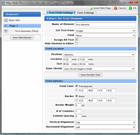
Fig.1. The Text Field Settings tab
The Font Settings Tab
Option | Default | Meaning |
|---|---|---|
Font Face |
| Specifies the font applied to the text within the element |
Font Sizing | Fixed Font Size | Allows to set the font size as
|
Font Size | 12 pt | Specifies the font size for fixed font sizing Applicable to Fixed Font Sizing |
Min. Font Size Max. Font Size | 12 pt 12 pt | Fields are visible if Dynamic font sizing is chosen, and specify the range, in which font size is dynamically changed Applicable to Dynamic Font Sizing |
Relative to |
| Select a field to be used as a source for calculating the relative font size Applicable to Relative Font Sizing |
Scaling Ratio | 0 | Percent of the original size of the field selected in "Relative to" Applicable to Relative Font Sizing |
Default Font Size | 0 | Font size to be applied if the source field contains an empty value Applicable to Relative Font Sizing |
Font Color | C:0 M:0 Y:0 K:100 | Specifies the font color |
Leading | Auto | Specifies the line spacing |
Space Before Space After | 0 pt 0 pt | Specifies the indents before and after paragraph |
Enable Advanced Text Styling | No | If selected, adds two more tabs with advanced text configuration settings |
Background Color in Rich Text Editor | Disabled | Available only if Advanced Text Styling is activated. Allows setting a background colour from the predefined list, which will be applied in the Rich Text Editor window. |
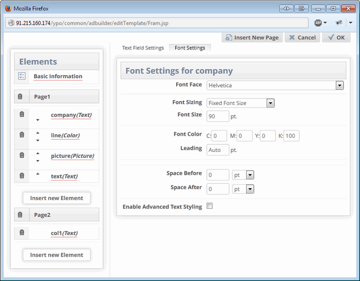
Fig.2. The Font Settings tab
Performing calculations
A text field can be configured to perform calculations. To do this, follow the steps:
Create some text fields, which are supposed to hold the source values for calculation (e.g. “Price”, “Discount” etc.). These fields must contain only integer or decimal numbers, or refer to another module (“Get Text from Module”), which holds numeric values you need.
Create a text field, which you want to use as calculation field.
In Get Text From select box choose “Calculate Content”.
In formula fields select the names of the fields, which you want to use as a source to provide calculation.
Choose calculation operation:
Addition (+)
Subtraction (-)
Division (/)
Multiplication (*)
Choose output type: integer or decimal.
Choose units and place where they should be displayed: before or after the calculated number.
Note, that £ (Pound) and € (Euro) signs will be shown in generated PDF only if Unicode font is using.
Now, the configured field will perform calculation depending on the values in the source fields.
Another option in Get Text From select box labeled “Calculate Content (Advanced)” allows you to enter a freehand formula. Name for each text field should be placed in ${ }. In this mode, you can use any quantity of fields involved in the calculation and also the simple numbers.
${text_field_1}-${text_field_2}-100*2s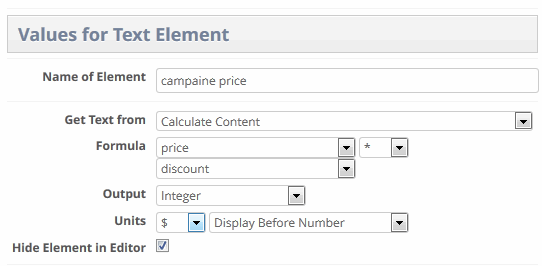
Fig.3. Configuring the calculation field
Relative Placement of Elements on Ads
This feature makes it possible to define the location for an element in an AdBuilder template relative to the position of another element on the page and applies to all element types: Text, Picture and Color.
The parameter Position is used to define whether or not the element should be placed relative to some other element on the page. The Position select-box in the Edit template window has two options: Absolute and Relative.
Absolute position means that the coordinates specified in the Location boxes will be calculated in absolute terms.
If there is more than one element on the page, the Position box lists all other fields found on the page, so you can select an element relative to which the current field should be positioned.
When setting position of one element relative to the other, two offset fields appear. The first Offset field defines the corner of the element that will be attached to the absolute one. The second Offset defines the corner of the absolute element to which the relative element will be attached. The options for the offset are the following: Top left, Top right, Bottom left, and Bottom right.
In addition, you can define offset distance between the two elements. The distance is defined accordingly in “X” and “Y” fields representing the corresponding axis.
Note! The starting point of the coordinate axis is top left. This means that for moving the element downwards, the value for the “Y” axis should be positive and vice versa. The same logic is applicable to “X” axis: moving to the right should have positive offset value, moving to the left — negative offset value.
Managing Text Overflow
Relative placement of the text boxes is also used when we have too much text entered into one text field that causes text overflow.
In the Make Ad window, text fields that have the text that does not fit into the field boundaries will be red-highlighted, and in the right pane above the PDF Preview window, there will be links to these fields that will lead you directly to the pages and fields that have text overflow. The text of the links will inform the user that text field has too much text and has been truncated, also specifying the name of the text field and the page.
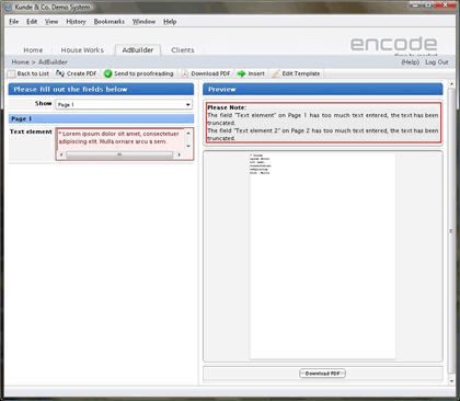
Fig.4. Text overflow notification in the Make Ad window
After detecting the amount of text that doesn’t fit into the text field with the defined dimension, the Insert Another Field option is used to manage the remaining text. The Insert Another Field button inserts one more field location block with the same fields as the first field location block (Position, Location, Size, Auto-Shrink). The Position field value has two values in the list: Absolute and Relative to Previous Field.
The “Relative to Previous Field” option allows to define new text field position in relation to the previous one. There is the possibility to insert as many new text fields as needed to manage all the text of the current element. Unnecessary elements can be deleted by clicking the Delete icon next to the text field.
Note, that if Dynamic Font Size is enabled for the text field, text overflow may not happens due to automatic decreasing of the font size respecting “Min. Text Value”.
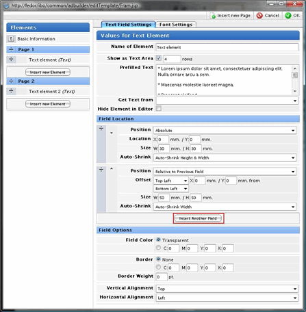
Fig.5. Inserting text fields to manage text overflow
Shrinking options
One more option related to text elements that should be discussed in more details is Auto-Shrinking. The Auto-Shrink parameter is used to define if the element should shrink in size (height and/or width) according to its contents. This feature only applies to Text elements.
There are five possible options:
Don’t Shrink — the element is not adjusted but is drawn according to the size specified in the Size H: mm / W: mm fields.
Auto-Shrink Height — the height of the element is adjusted to only be the height necessary to accommodate the amount of text entered in the field but cannot exceed the height specified in the Size H: mm field.
Auto-Shrink Width — the width of the element is adjusted to only be the width necessary to accommodate the amount of text entered in the field but cannot exceed the size specified in the Size W: mm field.
Auto-Shrink Height & Width — the height and width of the element are adjusted to only be the height and width necessary to accommodate the amount of text entered in the field but cannot exceed the values specified in the Size H: mm / W: mm fields.
Auto-Shrink Downwards — the borders of the text elements will be shrunk towards the bottom of the text element border.
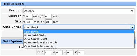
Fig.6. Text Element: Shrinking options
Rich Text Editor
The Rich Text Editor enhances the text element functionality by enabling the user to format parts of the text entered into a text field when editing an Ad. You can apply styles to text on the character and paragraph level, make your text bold, italic and indented, create bullet lists etc.
Configuration
The Rich Text Editor is activated per text fields by selecting the Enable Advanced Text Styling checkbox on the Font Settings tab. Selecting this option adds two tabs to the Text Field configuration window: the Character Styles and Paragraph Styles tabs, where you can configure character and paragraph styles that users will then be able to apply to text they enter in the field.
The Character Styles tab is used to specify fonts to be used for bold, italic and bold italic text. Also, Undeline formatting function can be enabled.
Apart from the default Normal character style, which uses the settings from the Font Settings tab, you can create your own custom character styles defined by a specific font face, font size, and color.
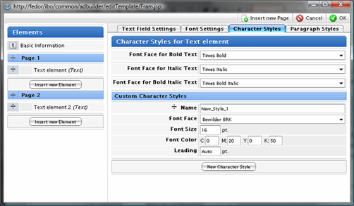
Fig.7. The Character Styles tab
Having character styles configured it is possible to apply them to imported content into a rich text field within AdBuilder. Meaning: it is possible to inherit formatting (only Bold, Italic, Underline) from the imported rich text field.
Note!
Even though Advanced Text Styling has become available for the "Get text from" text element in version 10.2.0, only formatting for Bold, Italic and Bold Italic text is supported. Paragraph and character styles configured and displayed in rich text fields will not be applied in generated PDF.
Also, pay attention that Rich text fields without images only are supported in "Get text from" text elements. For the rich text values containing images, PDF generation will fail.
The Paragraph Styles is used to enable or disable the indentation and bullet list options as well as create custom paragraph styles defined by specific font settings, alignment and indentation settings.
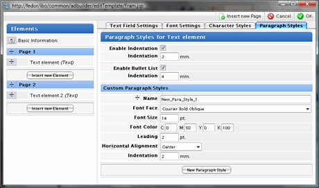
Fig.8. The Paragraph Styles tab
In the Make Ad window, a rich-text enabled text field can be identified by the Edit icon placed on its right. Clicking the icon opens the editor in a pop-up dialog, where all the options that have been enabled for the field are available on the toolbar.
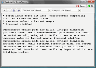
Fig.9. Edit Text Element window with Rich text enabled
Please note: next combinations of custom paragraph, custom character style and Bold/Italic and Bold Italic text are not supported
Custom Paragraph style + Bold/Italic ---> defaults to Normal style |
Custom Paragraph style + Bold and Italic --->defaults to Normal style |
Custom Character style + Bold/Italic ---> Bold/Italic text style is not applied |
Custom Character style + Bold and Italic ---> defaults to Normal style |
Known limitation:
RTE: click on "Enter" keyboard button to insert new line defaults to "Normal" paragraph style in RTE as well as in generated PDF