How to create a Bar Chart Widget
To add a Bar Chart widget, follow these steps:
Navigate to the Widget Library (see Manage Widgets for more details).
Locate Bar Charts and click on the card.
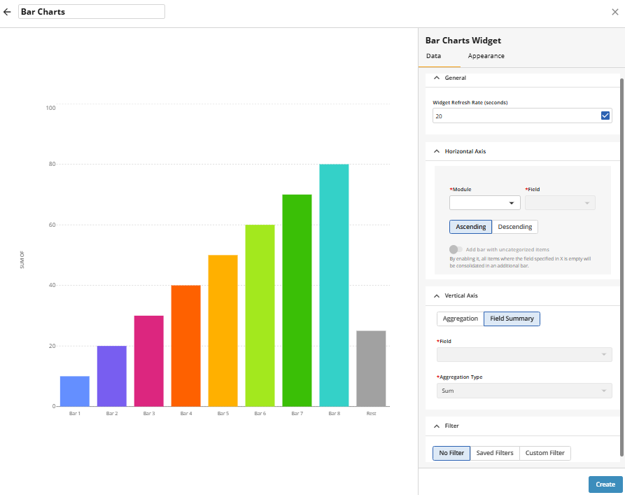
Enable or disable the Widget Refresh Rate (in seconds). If enabled, set a time interval — the widget will automatically refresh unless previous request is still in progress.
Select the Module and the Field for the Horizontal Axis.
Specify sort order: Ascending or Descending.
Enable Add bar with uncategorised items if needed.
For date aggregation, specify time interval (Day, Week, Month, Quarter, or Year), using the Group Date Values By field.
Configure the Vertical Axis display:
Field Summary – displays the total number of items in the module
Aggregation – aggregates values from a numeric field.
For Field Summary, configure:
Field (required): The numeric field to summarise.
Aggregation Type (required): e.g. sum, average.
Apply a Filter to limit the dataset shown. Use Saved Filters to select an existing module filter, or choose Custom Filter to create a new one.
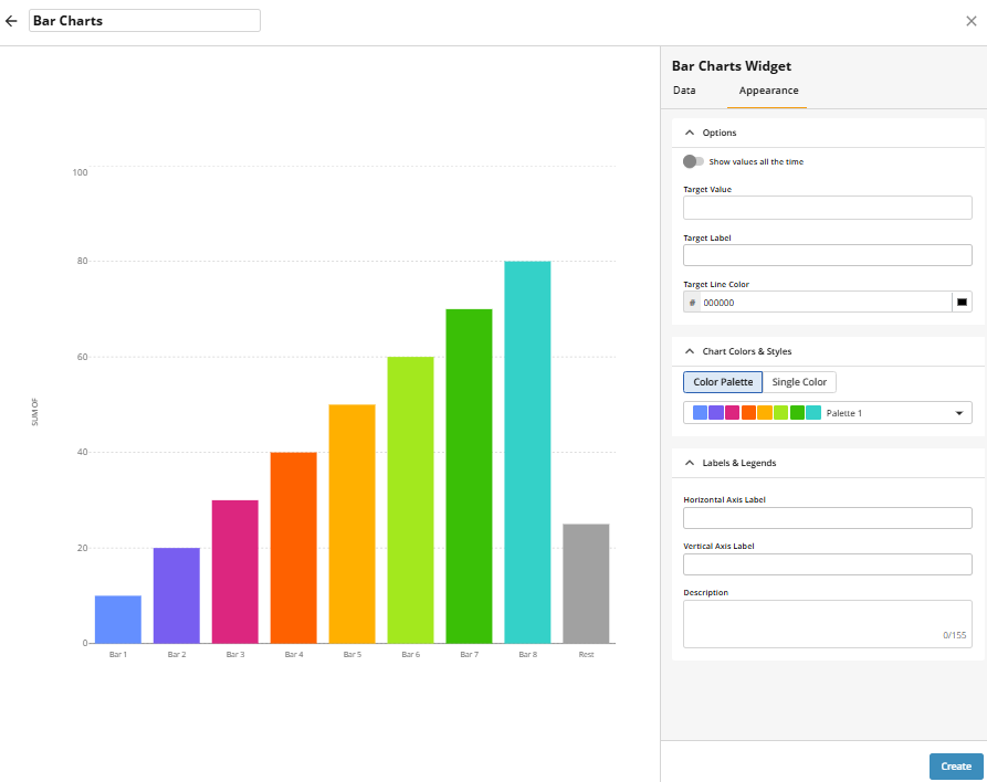
Go to the Appearance tab to adjust the visual settings or click Create to save with default settings:
Choose whether to always show values on the bars by enabling or disabling Show values all the time.
Optionally, enter a Target Value and an optional Target Label.
Select a Target Line Color.
Define Chart Colors & Styles: choose either a Color Palette (multiple colours) or a Single Colour.
Optionally, add labels for the Horizontal Axis and/or Vertical Axis.
Optionally, enter a Description to display at the top of the widget.
Click Create to confirm your settings and add the widget.