Overview
Form with Tabs view enables you to display item information and related data organised into separate tabs. It’s ideal for structuring complex forms into manageable sections, improving clarity and user navigation.
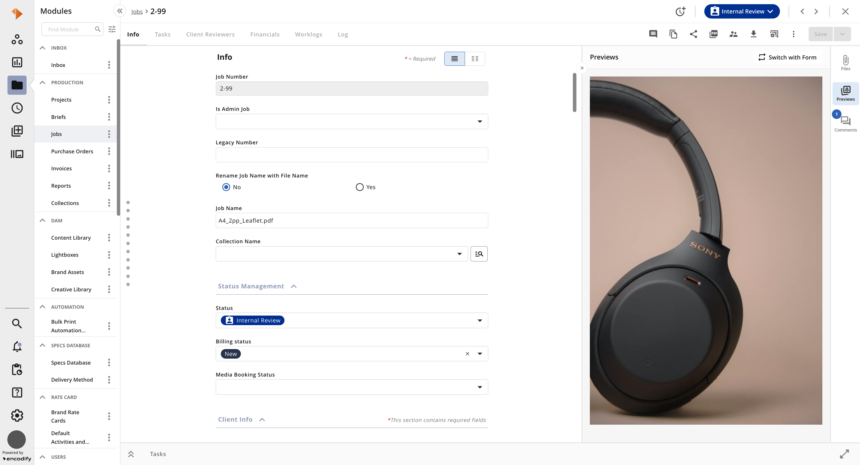
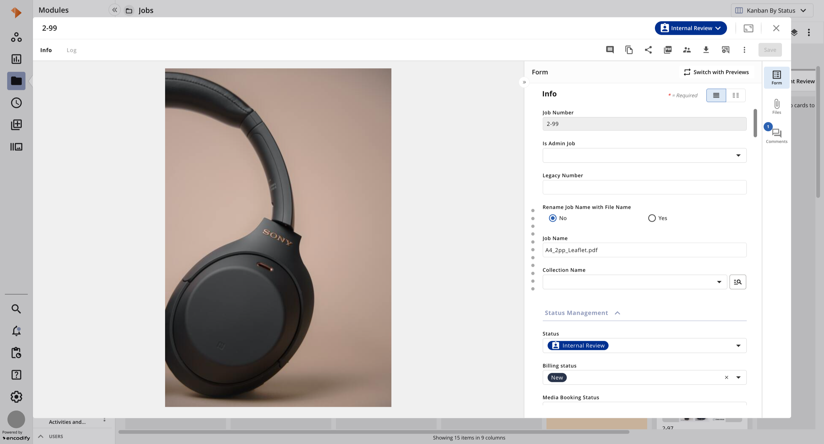
The table below provides a quick overview of Form with Tabs View:
Action | Visual Guide |
The horizontal tabs enable users to switch between different configured views.
| 
|
The Log Time button allows you to both view your time entries added to that specific item or click the New Work Log button to add a new work log entry (see Hours App for more details)
| 
|
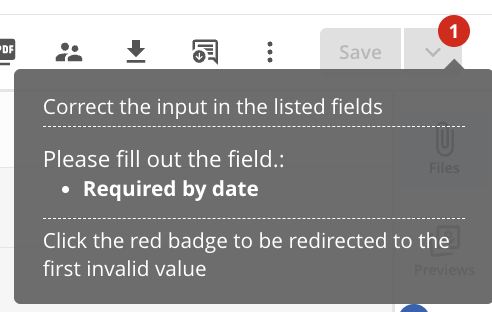
The Save button becomes active once changes have been made to any visible fields within the item view. If any required fields are missing or validation errors are present, a red badge will appear to indicate the issue—providing clear guidance on why the Save button may remain inactive.
| 
|
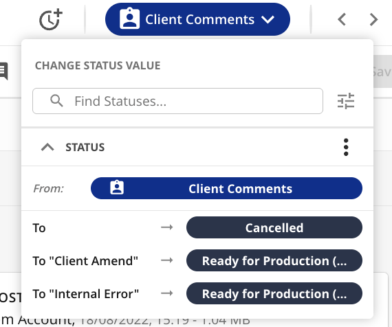
The Change Status dropdown allows you to view and select from the available workflow transitions.
| 
|
Opens Item View in Fullscreen mode(note: available from Item Modal and Item opened from Split view)
| .png)
|
Navigate between the previous and next items
| 
|
Launch Online Proofing for the specific item
| 
|
Allows users to Copy the current item to create one or more new items.
| 
|
Enables users to open the Share modal, allowing them to share an item, share files, and invite guest users.
| 
|
Allows to Generate PDF
| 
|
Allows to Select and Assign User Group(s) to the corresponding item
| 
|
Allows to Download files
| 
|
Allows to Download annotated files
| 
|
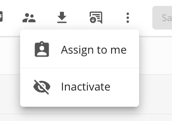
The actions menu provides access to a range of additional features—including Assign to me, inactivate, and more.
| 
|
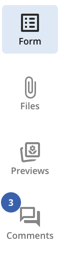
This expandable and collapsible panel provides access to the following tabs that can be switched via the sidebar with corresponding icons: Previews – Displays a preview based on the pre-configured media converter, depending on its settings and the uploaded file type. Files – A dedicated panel offering a consolidated overview of all configured file fields and converted renditions. Comments – Presents a complete view of all comments and replies associated with the specific item, making it easy to follow discussions in context. Form - panel that shows item form with configured fields, their content, separators. (former “Metadata” tab)
| 
|
Allows you to switch between Form in item view and Previews in item side panel. Your chosen preference will be automatically applied the next time you access the view, ensuring a consistent and personalised experience.
| 
|
Allows you to switch between Previews in item view and Form view in item side panel. Your chosen preference will be automatically applied the next time you access the view, ensuring a consistent and personalised experience.
| .png)
|
Toggle between displaying the fields within One Column View or Two Columns View
| 
|
The Switch Item View button displays your current item view and lets you switch between item views you can access. If you have configurator access, you can also add and manage item views directly from this dropdown, with changes applied immediately.
Note: The selected view does not persist — it resets to the default item view when leaving the item, refreshing, or navigating to/from Proofing (a separate route). | .png)
|
Displaying Inline Modules
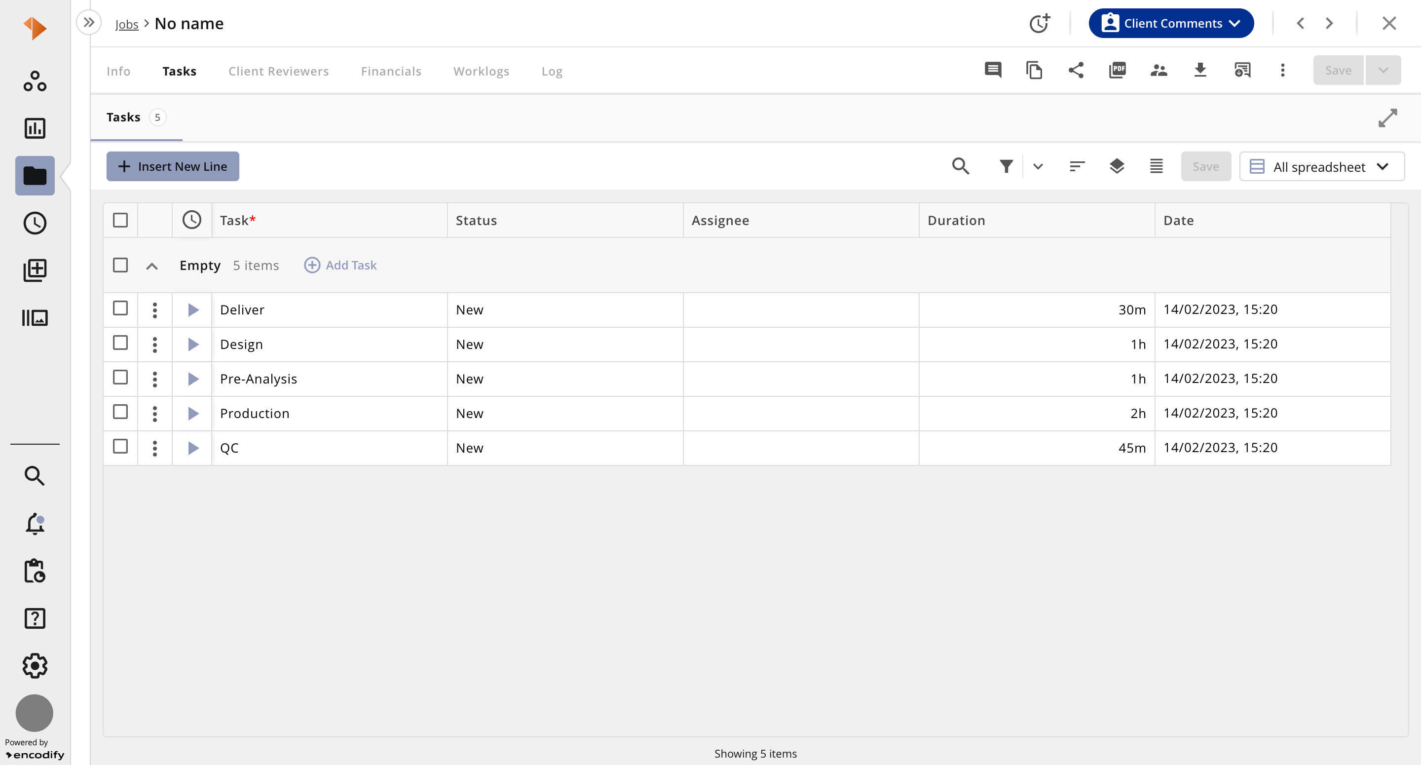
An Inline Module allows you to display related items from a child module. Its appearance depends on the configured view, but typically it will be anchored either to the top or bottom of the page. The module can be opened, expanded, or collapsed as needed. When expanded, the header of the parent module remains visible and accessible, helping users maintain context while working.