Configuration of guides(Modals and Tooltips)
Only system or site administrators are allowed to CRUD guides including creation of new ones.
To configure new guide:
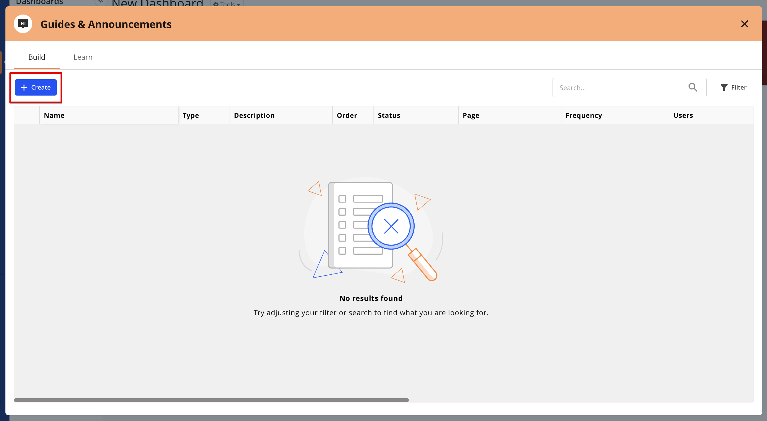
Click on Resource Centre icon in sidebar > Guides and Announcements > "Build" tab
Click on "Create" button
Select "Guide" in opened popup
"Create" button in "Build" tab
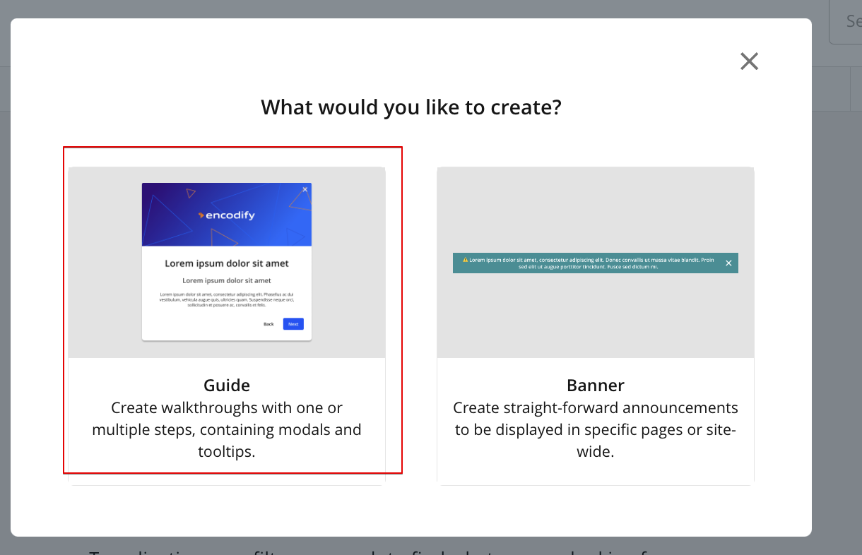
Popup with prompt to select guides or banners
In opened configuration modal it is possible to specify guide attributes, target users and pages, configure steps etc.
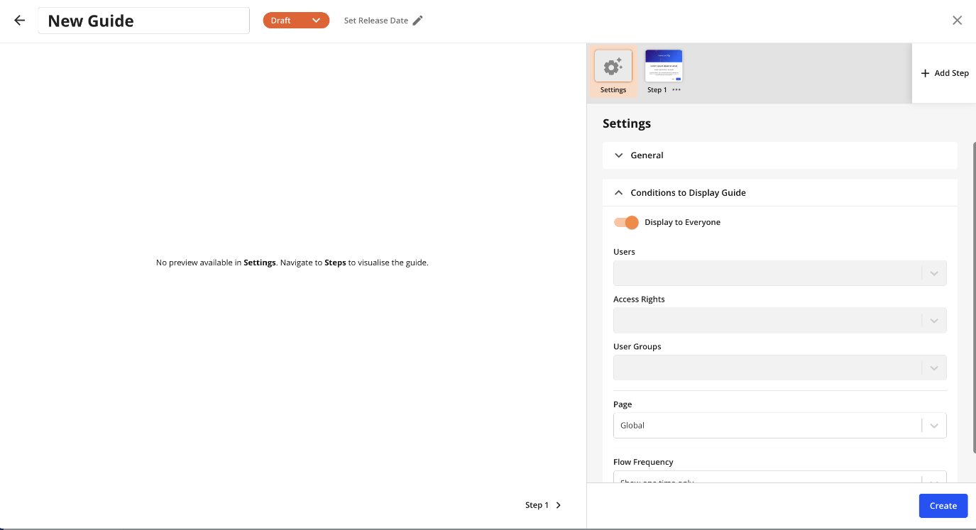
Configuration modal
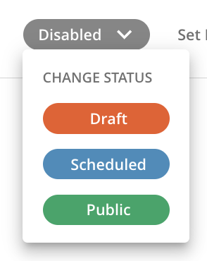
There are next statuses available for selection and applying to guides:
Inactive guides
"Draft" - default status while creating new guide or for copied guide. guide with this status is no visible to users
"Scheduled" - guide with this status will go live once specified Release Date occurs. Guide with this status is no visible to users
"Disabled" - expired guide or guide that was disabled by admin. Guide with this status is no visible to users
Active guides
"Public" - guide with this status goes live immediately and visible to users.
Along with guide's status Release date and Expiration date can be specified in configuration while selecting "Scheduled" or "Public" status or while editing Release date for previously selected status
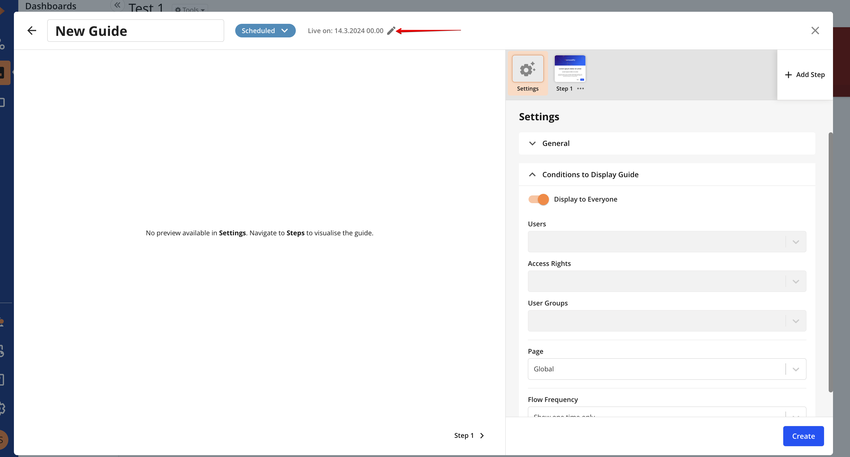
Set Release Date or Expiration Date in config header
Release Date - date when guide will become live as result visible to user.
Expiration Date - date when guide will be disabled and won't be visible to user.
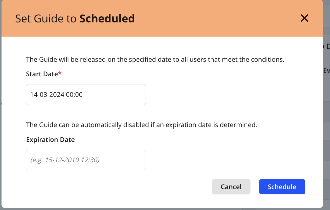
Example of modal to specify Release and Expiration date
Note:
For guide with status "Public" - Release Date can't be specified
For guide with status "Scheduled" - Release Date is mandatory
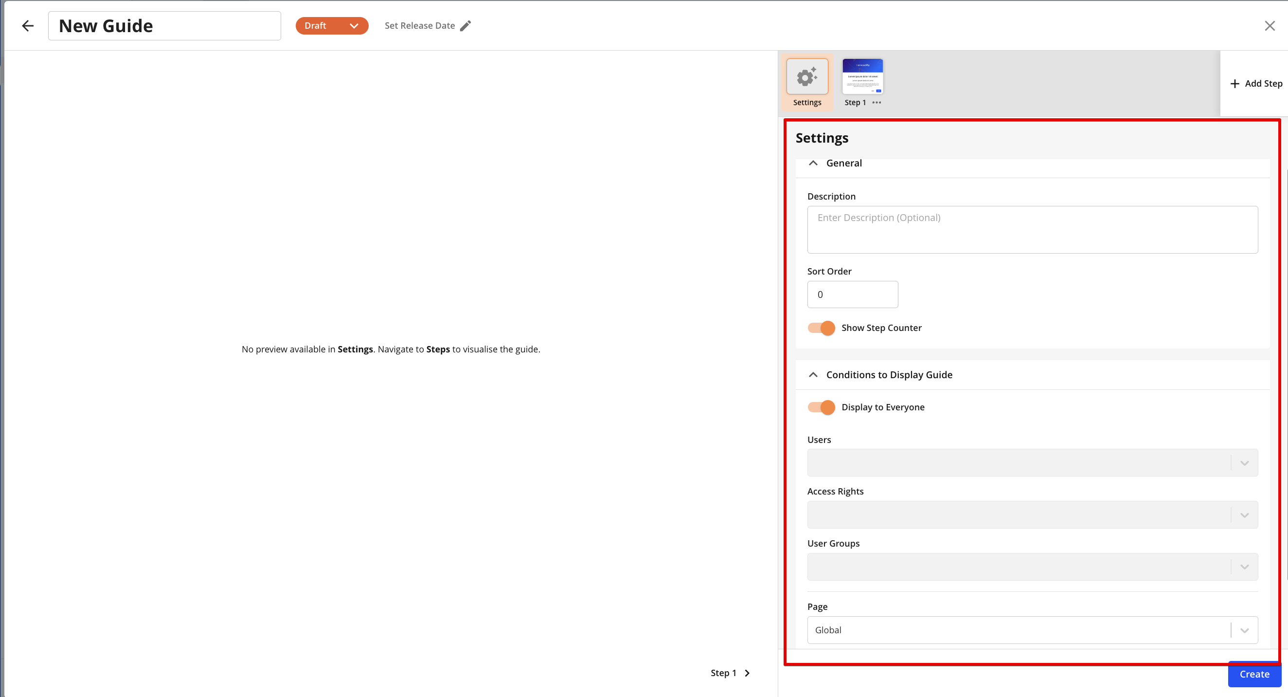
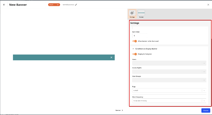
Settings section
In this sections can be specified for guide:
Description - input field for adding info about guide that should be visible in Guide search
Sort Order - defines order of triggering guide in queue if multiple guides are configured for the same page
Display to Everyone - allows to show guide for all users if enabled or specify user or access right or user group guide should be shown for.
Page - allows to select page guide will be shown on:
Global (default page where guide will be shown on any page per site)
Dashboard
Workspace
Module View
Item View
Adbuilder(available for selection if Adbuilder is configured on site)
Proofing
Rule List
Rule View
App (available for selection if supported CAS or Hours App is configured on site)
Supported views
Page | View |
|---|---|
Module View |
|
Item View |
|
Adbuilder |
|
Hours App |
|
Rules view |
|
Proofing |
|
Flow Frequency - defines how guide should be triggered to be shown for user on specified page
Show one time only - default type, guide will be shown automatically first time user enters specified page.If guide is snoozed then it can be shown automatically again
Always show - guide will be shown automatically everytime user enters specified page.(Note: already shown guide won't be triggered again automatically on specified page in current user session.User should relogin again to trigger guide automatically)
Do not show automatically - guide won't be triggered automatically, but can be launched manually from Resource Center > Guides and Announcements or by clicking on badge if it was enabled and specified
Settings section
Each guide has at least 1 step with default settings predefined.New step can be added as last step in guide by default.
Max. 20 steps can be added for each guide.
Step can be moved right/left, copied or deleted via step action menu
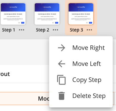
Step action menu
Step configuration
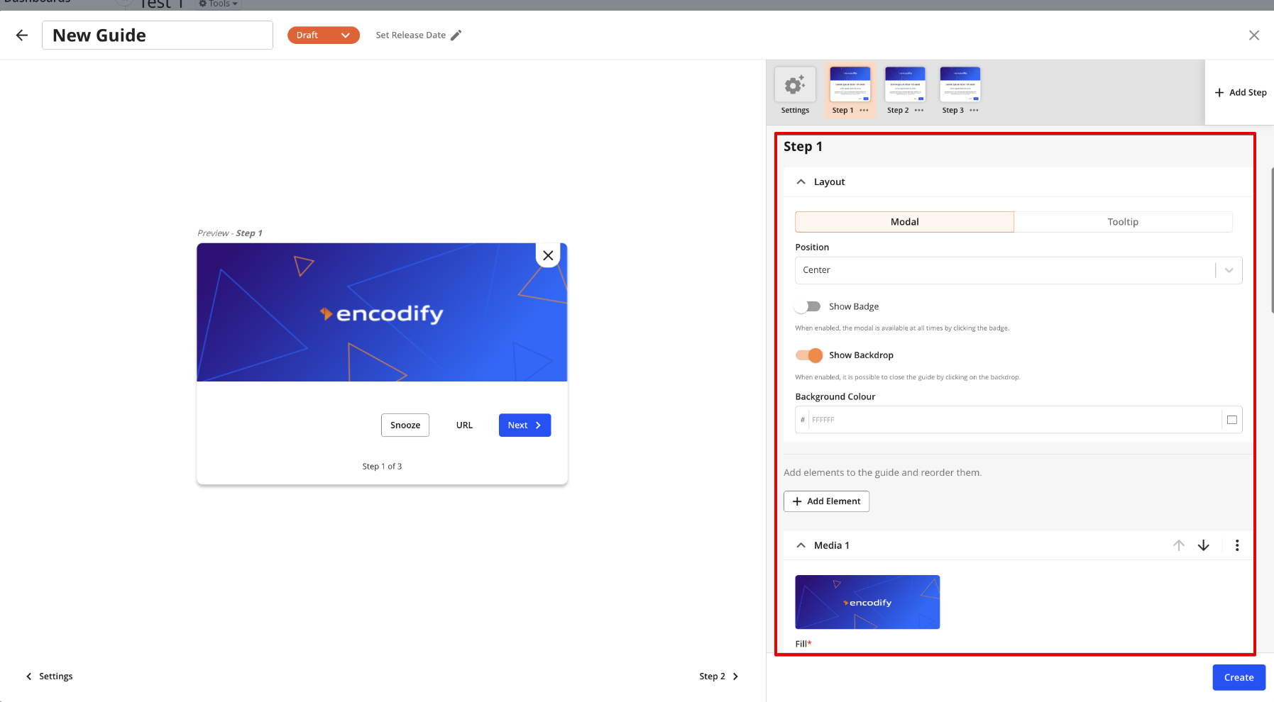
Step configuration section
In step configuration user can specify next attributes/elements for each step:
Layout: Modal or Tooltip (Note: tooltip layout is not available for selection if Global, Dashboard page is selected or multiple apps are linked)
Position (For Modal only)
Show Badge - allows to hide/show badge on specified target element
Target Element - allows to select target elements to link each step.List of available target elements depends on selected page in settings
Page | Target Element |
|---|---|
Dashboard | No target elements available |
Workspace |
|
Module View |
|
Item View
|
|
Adbuilder |
|
Proofing |
|
Hours App |
|
CAS Storyteq/Remake |
|
CAS Print |
|
Rules List |
|
Rule View |
|
Show backdrop - allows to enable/disable backdrop
Background Colour - allows to specify background colour for each corresponding step.Default is #FFFFFF
Add Element - allows to add new element of type: Media,Text,Button
"Media" element - allows to upload image, video, audio files for corresponding page.
"Text" element - allows to add content for corresponding step using RTE
"Buttons" element - allows to enable/disable buttons or adjust them on each guide's step.
"Previous/Next Step" button - navigation between steps
"Link to URL" button - redirects to specified page
"Dismiss" button - closes guide(the same logic as click on "X" button or on backdrop)
"Snooze button" - allows to snooze(delay) guide for the certain period of time. Guide will be shown automatically again if period the guide was snoozed for is passed
Allignment - allows to define position of buttons on each step
Media, Text, Buttons element can be moved up/down, copied or deleted via corresponding menu
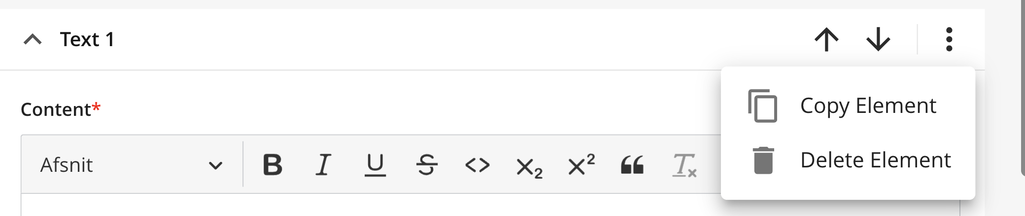
CRUD elements
Each step UI is visualised in Preview section where user can view applied changes
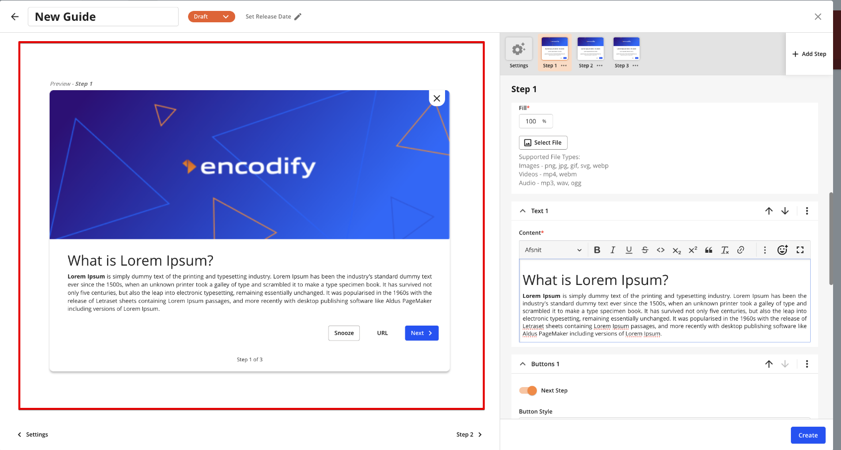
Preview section
Configuration of Banners
In general configuration of banners is almost identical as for guides but there are some config points typical for banners only.
Click on Resource Centre icon in sidebar > Guides and Announcements > "Build" tab
Click on "Create" button
Select "Banner" in opened popup
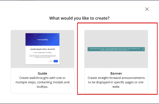
Popup with prompt to select guide or banner
Settings section
Settings section of banner configuration
The next points are not identical to guides and are specific for banner settings:
Allow Banner to Be Dismissed - allows to hide/show "x" button in banner
Flow Frequency - defines how banner should be triggered to be shown for user on specified page
Show one time only - default type, banner will be shown automatically first time user enters specified page.
Always show - banner will be shown automatically everytime user enters specified page.
Note: banner can't be launched manually fro "Guides and Announcements" modal
Banner configuration section
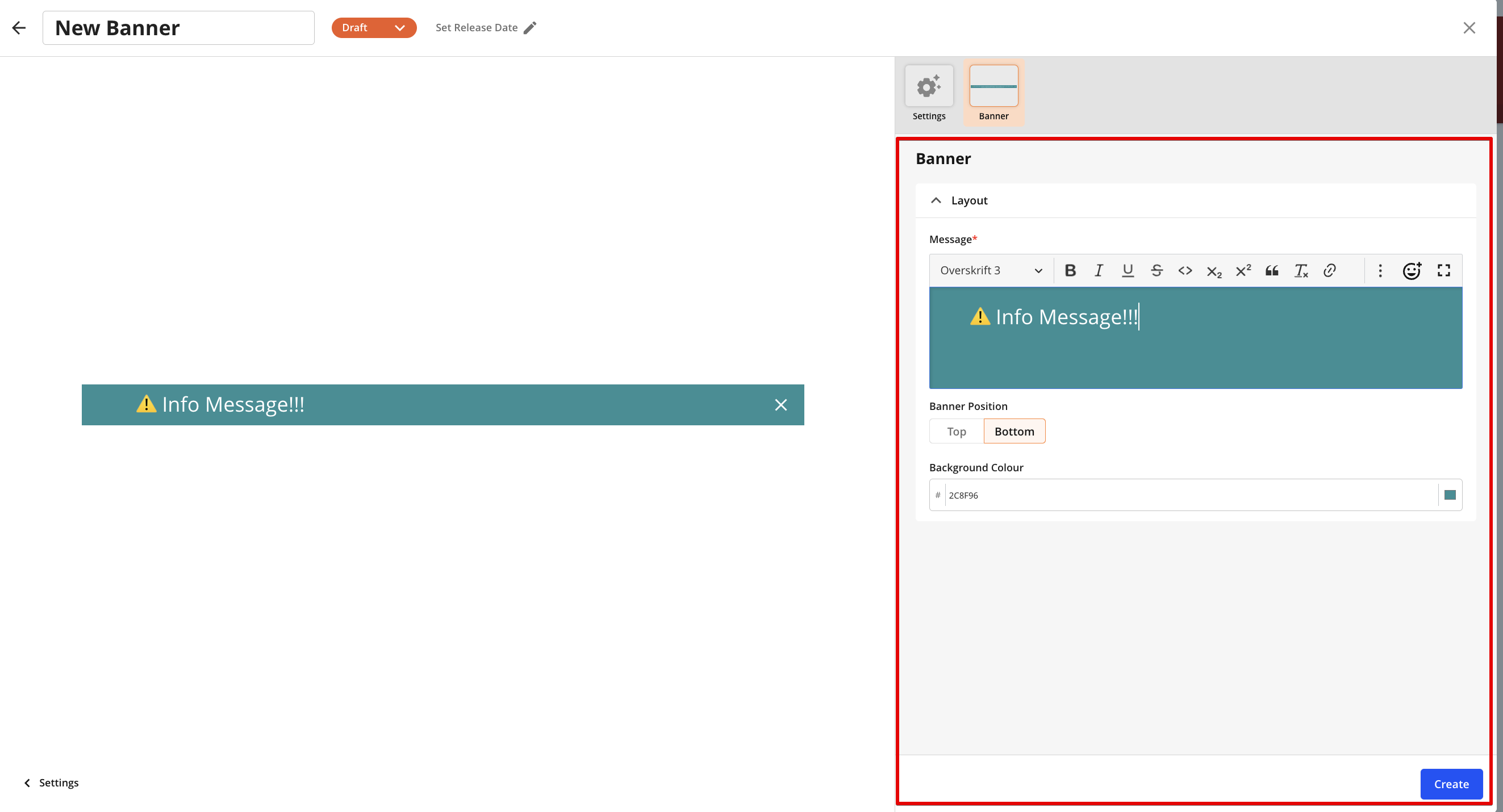
Message - allows to add content to be shown in banner using RTE
Banner Position - allows to select banner's position (Top or Bottom) on the page
Background Colour - allows to specify background colour for banner.Default is #2C8F96
CRUD guides/banners in configuration modal
CRUD existing guides can be performed by admins only via configuration modal
To open any existing guide or banner click on it's name in the search list in "Build" tab or click on "Edit" in ellipsis menu
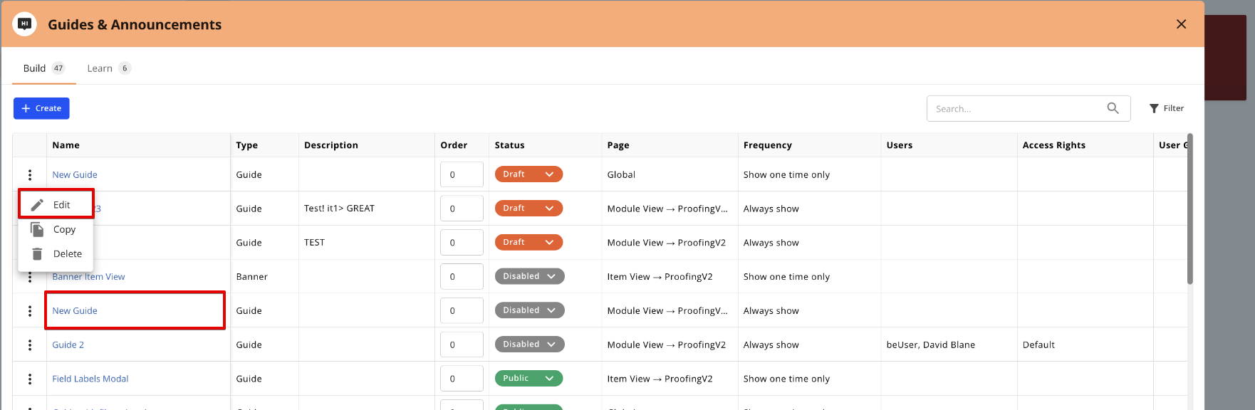
In opened configuration modal user is able to CRUD existing guide/banner: Edit, Copy,Delete
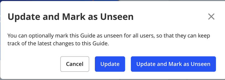
Note: while updating guide or banner with "Public" status it can be marked as "Unseen" that allows to trigger it automatically again on specified page and track latest changes for target users.
Known behaviour:
In case of specified in guide/banner configuration property(list of properties is below) is inactivated or deleted - such selected option will be cleared in guide config.
If inactivated/deleted property is the last / only option to display - guide/banner will be inactivated silently(status will be changed to "Disabled").
Removal value/Guide inactivation event is tracked and can be fetched in System Change Log(Location: Site Config > System Change Log)
Properties:
Module
Module View
Item View
Form tab/Wizard step
Field
Workspace
Dashboard
App
For those types will be just removed from guide and only disabled if not user and not access rights and no groups are specified:
Users
Access Rights
User Groups
Example:
Guide with Page - Module View, Modules - Module 1, Module 2, status - Public
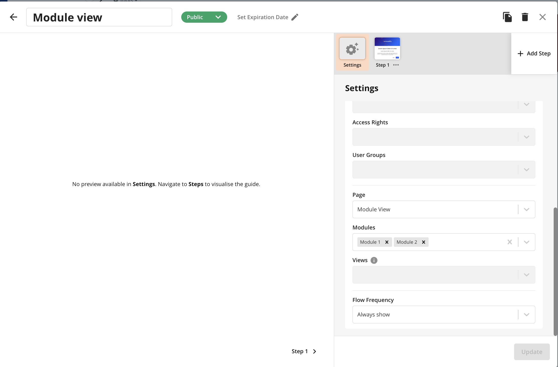
Module 1 is inactivated/deleted in site config --> "Module 1" value is cleared in "Modules" field, guide's status remains "Public
Module 2 is inactivated/deleted in site config --> "Module 2" value is cleared in "Modules" field, guide's status is changed to "Disabled"