Overview
The Theme Library in Encodify allows administrators to centrally manage and apply visual themes across the platform. A theme defines the visual identity of the user interface, including colours, logos, and styling elements. Using the Theme Library, you can create and maintain a collection of branded themes that reflect your organisation or specific user groups, ensuring a consistent look and feel across different teams, departments, or client environments.
Themes from the library can be applied at the site or user level, enabling enterprise-level personalisation while maintaining brand integrity.
Note: Some elements of Encodify’s interface, such as the Encodify logo in footers and app configuration areas, remain visible to preserve product identity.
Default Themes
Each site in Encodify is automatically assigned a default Encodify theme, providing a consistent visual foundation out of the box. This theme includes standard colours, branding elements, and layout settings designed to reflect the Encodify identity.
Administrators can view and compare these settings to guide the creation of new custom themes or to understand the baseline appearance applied when no other theme is assigned.
Default Theme Settings
Parameter | Default Value | Description |
|---|---|---|
Side Bar Colour | #252B36 | Defines the background colour of the left-hand navigation sidebar. |
Highlight Colour | #F58538 | Used for hovered or active elements such as links, buttons, and icons. |
Primary Button Colour | #2C62B2 | Sets the main colour for primary action buttons. |
Link Colour | #5499FF | Specifies the colour of text links throughout the interface. |
Status Colour | #399A96 | Controls the default colour associated with workflow status fields |
Company Logo | The Encodify logo | Upload a logo to be displayed in the top bar. Recommended max height: 90px. |
How to access the Theme Library
To access the Theme Library in Encodify:
Click Configuration in the side navigation menu.
Select Themes from the configuration options.
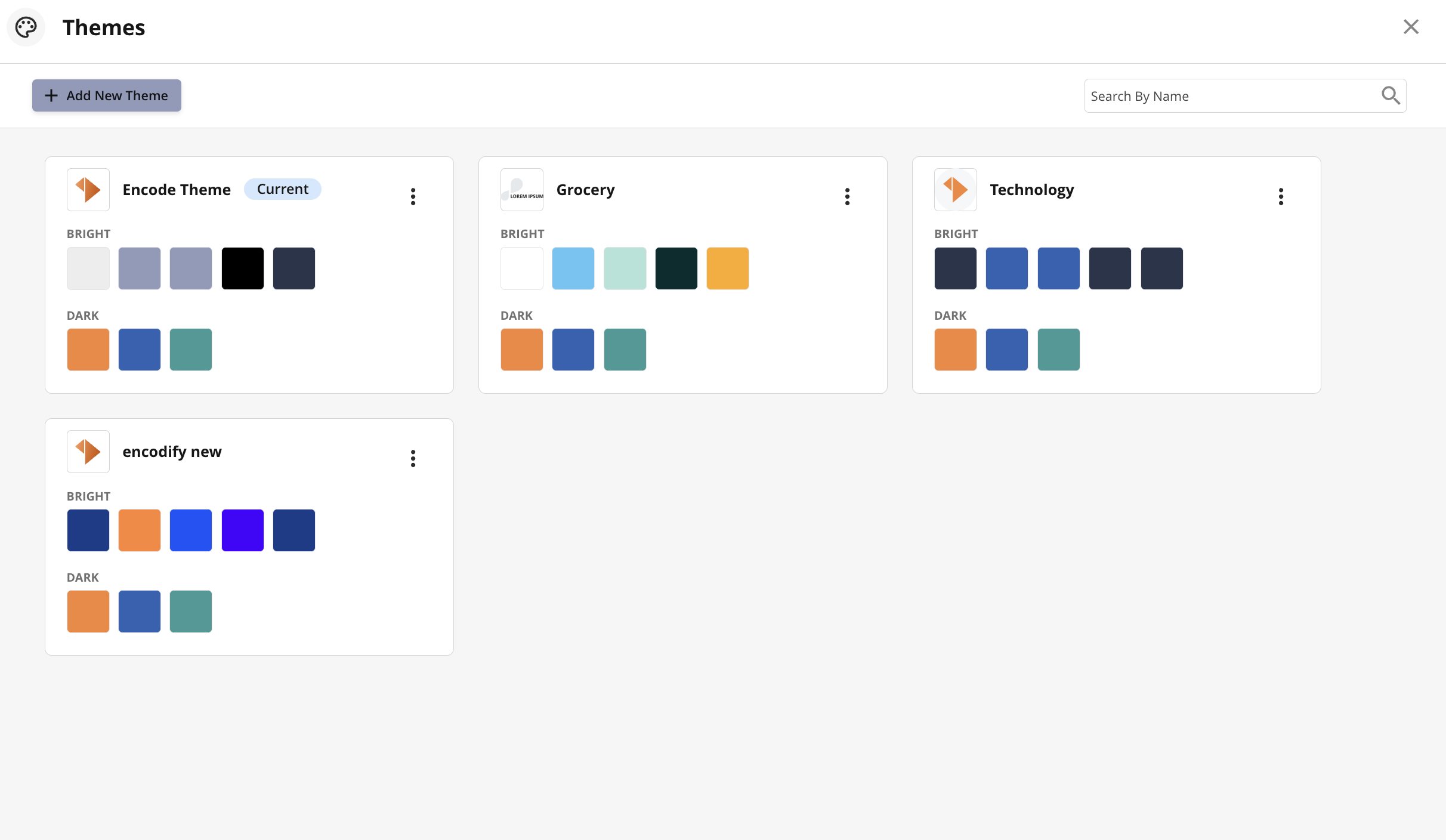
An image highlighting the theme library
Configuring a Theme
To add a new Theme, follow these steps:
Click Add New Theme to open the configuration wizard.
Enter a new Name for the theme or leave default name.
Upload a Logo to appear in the theme.
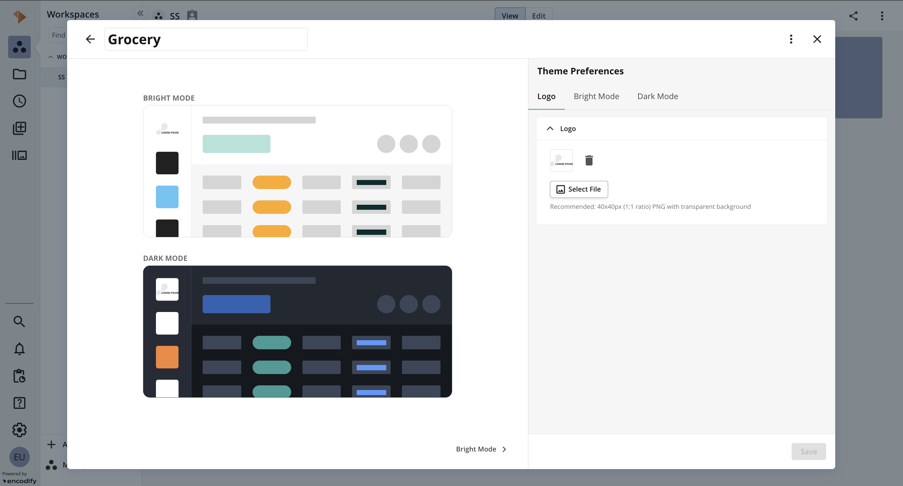
An image highlighting the Logo tab when adding a new Theme
Click the Bright Mode tab or click the Bright Mode button at the bottom to proceed.
Specify your branding for Bright Mode by selecting:
Side Bar Colour
Highlight Colour
Primary Button Colour
Link Colour
Status Colour
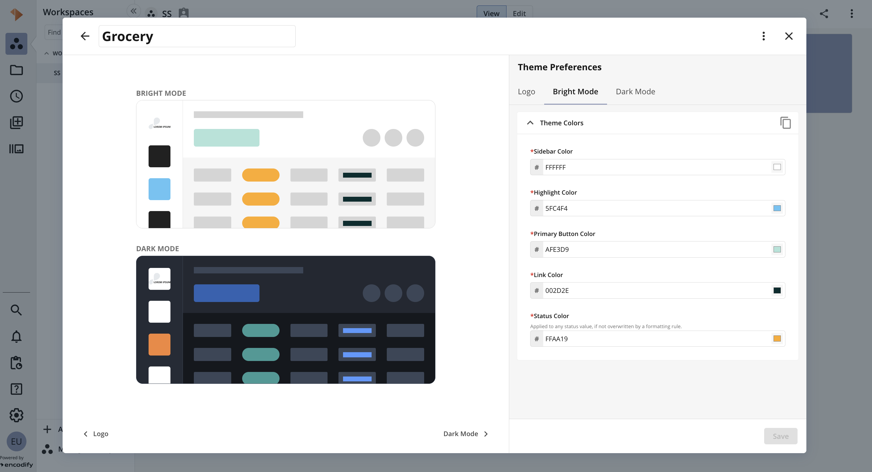
An image highlighting the Bright Mode tab when adding a new Theme
Click the Dark Mode tab or click the Dark Mode button at the bottom to proceed.
Specify your branding for Bright Mode by selecting
Highlight Colour
Primary Button Colour
Status Colour
7. Save to confirm and create the theme.
Note: colours from Bright Mode can be copied to Dark Mode and vice versa via the “Copy” icon
A live preview for Bright and Dark Mode will be displayed throughout the configuration process, allowing you to visualise the theme in real time before saving.
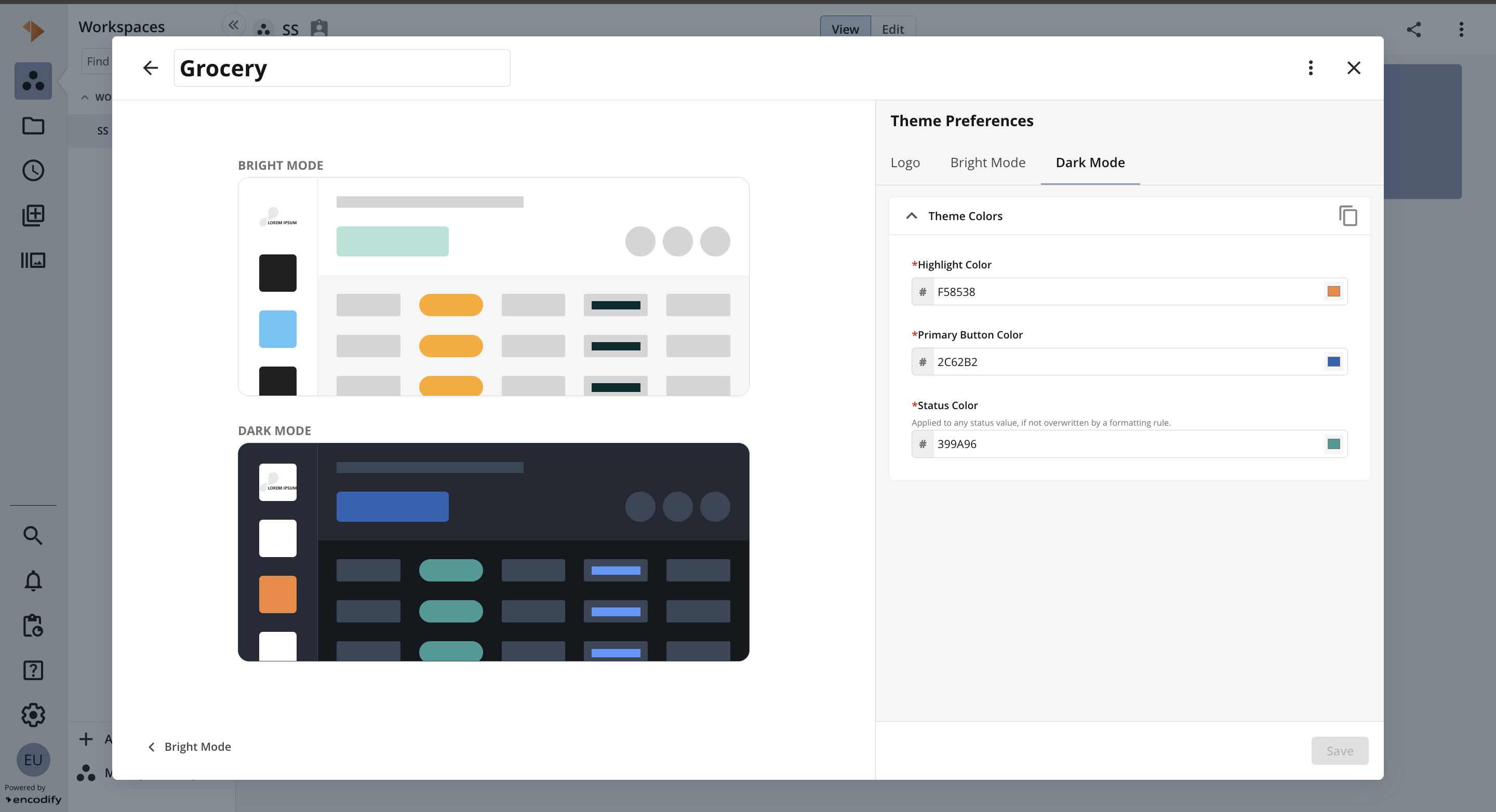
An image highlighting the Dark Mode tab when adding a new Theme
An image highlighting a theme applied to the user interface
Assigning a Theme to a Site
To apply a theme at the site level, follow these steps:
Navigate to System Configuration.
Locate the relevant site and click the edit (pencil) icon.
In the Edit Site window, select the Appearance tab.
In the Dashboard Theme dropdown, select the desired theme from the list.
Click Save to apply the changes.
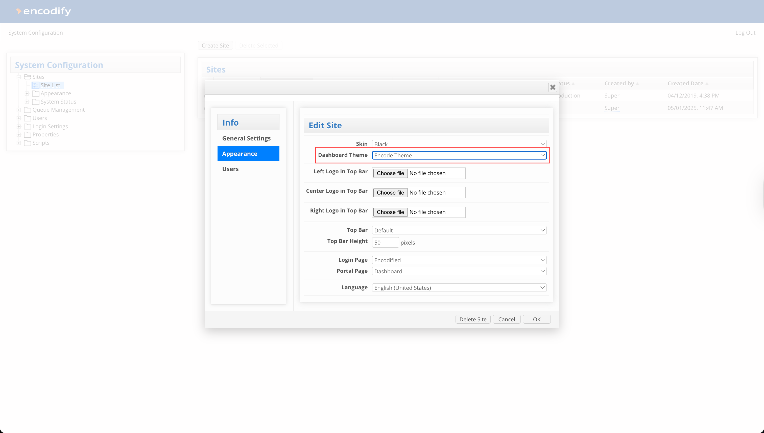
An image highlighting the Dashboard Theme setting applied to a Site
Assigning a Theme to a User
To apply a theme at the user level, follow these steps:
Navigate to Configuration → User Management from the side navigation.
Locate the relevant user and click Edit from the actions ellipsis
In the Edit User modal, go to the Site Details tab.
From the Theme dropdown, select the desired theme.
Click Save to apply the changes.
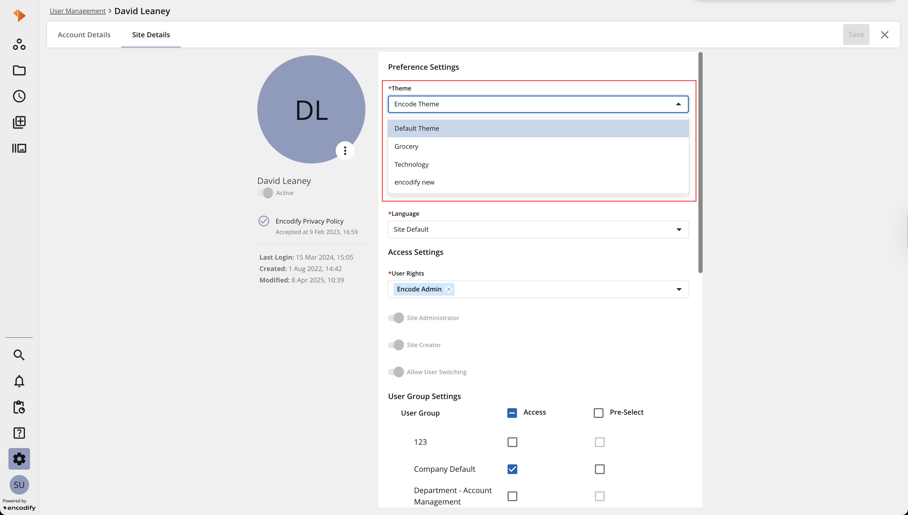
An image highlighting assigning a Theme to a user